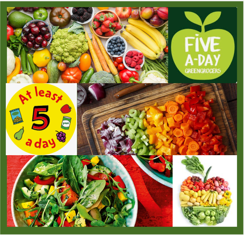
Below is my mood board for “five a day”. I’ve maintained consistency throughout by pairing each row with one long image and one smaller image. The entire composition centres around an abundance of authentic fruit and vegetables, aligning with the “five a day” theme and emotional keywords like Fresh, Natural, and Healthy. Vibrant colours dominate the palette, creating a visually striking effect.
Below are my initial two concepts for the personal poster, both designed to enhance spatial depth by arranging the fruit and vegetables diagonally or in a triangular formation. This creates a subtle visual guidance for the viewer, thereby emphasising the central text.

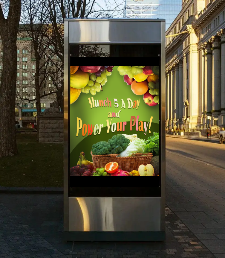
Finally, here are my two poster designs. The overall colour scheme and content remain identical; the sole distinction lies in the brightness and saturation of the text colour.
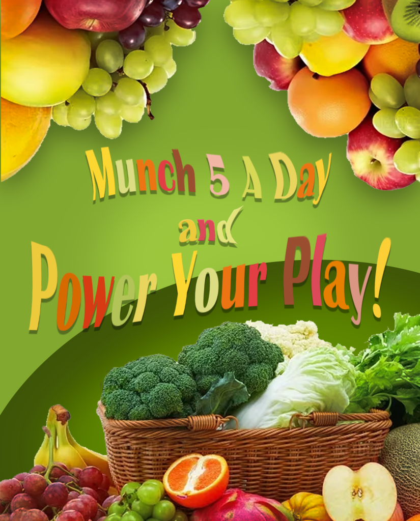
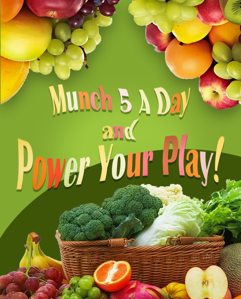
Following user research, a light-coloured poster was selected as the final design for the following reasons:
1.The title is positioned centrally within the frame with strong colour contrast. Should the first colour scheme be retained, the font colour would blend indistinguishably with the background, resulting in a poster lacking clear visual hierarchy.
2.The font on the right is more easily comprehensible for younger children, with the text appearing to float on the surface, making it more prominent.