High-Fidelity Prototype
Throughout the website, ample white space has been incorporated between various sections to prevent information overload and minimise reader fatigue. A clear reading hierarchy has been established through varying font sizes: “heading > subheading > body text > notes”. High-saturation, high-contrast colors are employed across the entire site, lending a cohesive and harmonious visual unity.
Throughout the high-fidelity prototype model, I have largely replaced all colors from the low-fidelity prototype. Retaining some dark shades as base tones, I removed the original overly repetitive warm hues and substituted them with a diverse palette of colour schemes. This approach aims to create visual resonance with individuals of different ethnicities, and nationalities. Simultaneously, I adopted colors consistent with the logo to ensure the overall aesthetic remained cohesive. The primary palette comprises red, yellow, blue, and green – colors that are less conventional yet form the core hues of the rainbow. This choice stems from the rainbow’s universal symbolism of beauty and hope across diverse cultures.
In sections where topics are largely similar yet content differs, I drew inspiration from notebook designs to create a similar wire-loop-like mechanism that connects adjacent sections. I then selected one of the two background colors to serve as the hue for this “button”.

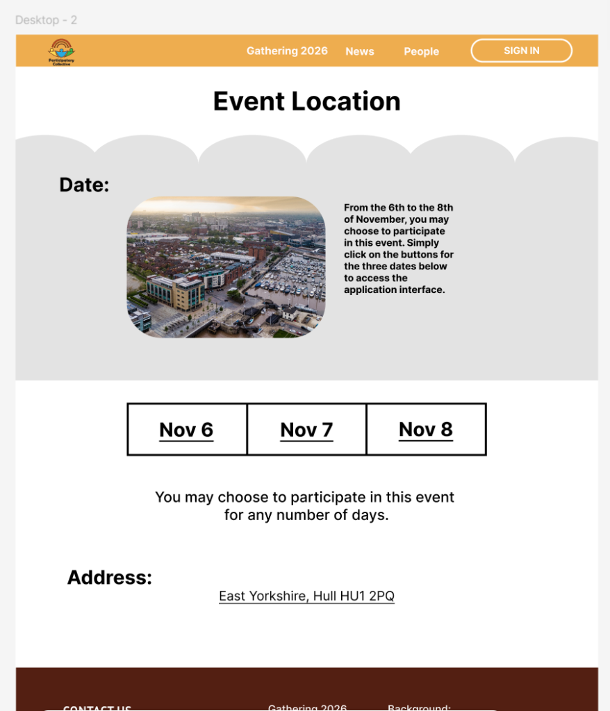
Throughout this entire website, I have incorporated decorative elements resembling cloud patterns into numerous background panels. Clouds are frequently employed as carriers for speech bubbles or information boxes, offering a visually prominent and approachable aesthetic that encourages users to click or read.
I hope a food festival can transcend its superficial entertainment and economic functions, transforming into a powerful community-building platform. My aspiration is that the focus should not merely lie in savouring the outcomes, but rather in valuing the process of exchange. By facilitating interaction between diverse nations and peoples, we can forge a more resilient, inclusive and vibrant community, whilst simultaneously stimulating tourism and economic consumption.
It is hoped that through this event, participants will engage in meaningful exchanges with strangers or members of different communities, thereby establishing preliminary “weak ties” – a crucial element for fostering innovation and disseminating information. Simultaneously boosting the local economy and attracting transient populations, this initiative will foster social development within Hull, stimulate tourism growth, and increase visitor numbers.
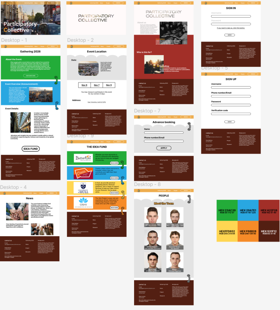
Below is my high-fidelity prototype. (Click the underlined text to view.)
The buttons are clearly defined, minimizing user errors. The website employs intelligent transitions to ensure a seamless experience when navigating to the next page, eliminating abrupt interruptions. Additionally, strategic use of white space on each page helps reduce reading fatigue.
Visual Identity System
Font Selection:
For the overall font selection, I ultimately chose the “Inter” font—commonly used on most official websites—as one of the foundational fonts. This ensures users can clearly locate the information they need.
On interior pages, I mostly stick with the same font as the title. For a small portion, I adjust the stroke weight to make it look distinctly different from the base font.
Throughout the website, I primarily use variations in font weight and size to create contrast, preventing the site from appearing monotonous. This structured typography lends a sense of formality, enhancing the overall credibility of the website.
Color Selection:

In terms of color selection, I predominantly opt for highly saturated hues—colors reminiscent of the rainbow.
The primary reason for choosing high saturation is that, visually, such colors paired with brighter backgrounds effectively highlight text, creating strong contrast. Additionally, high-purity colors instantly capture viewers’ attention, making them ideal for highlighting content. Their distinctiveness helps brands or messages leave a lasting impression on audiences.
A rainbow consists of seven distinct colors, yet they are not sharply separated but blend seamlessly together, collectively forming a unified force. This mirrors the website’s theme and embodies the fundamental principle of participatory collectives: regardless of background, identity, or ability, every member holds equal value and the right to be heard. The rainbow is perfect, yet real-world collective collaboration is often flawed. We hope this initiative will help many people change their perceptions of one another.
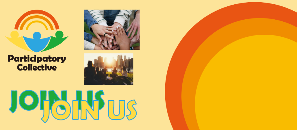
Social Media Campaign Examples:
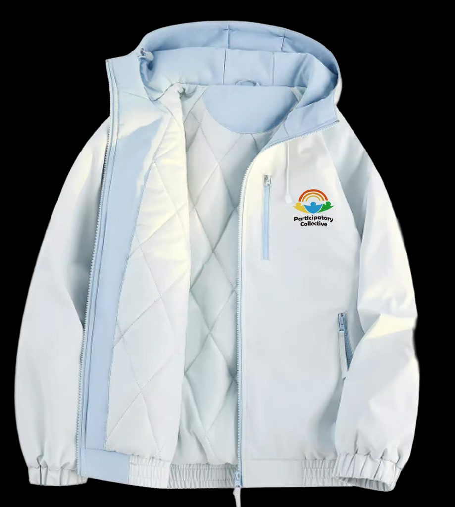
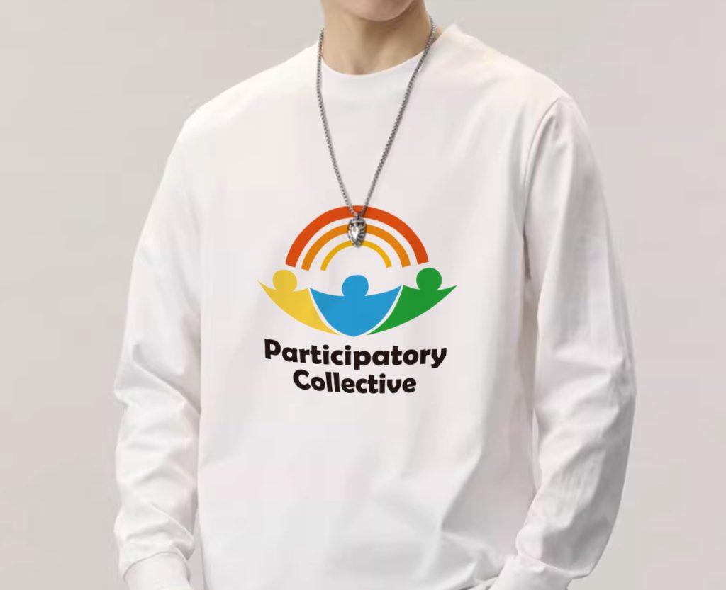
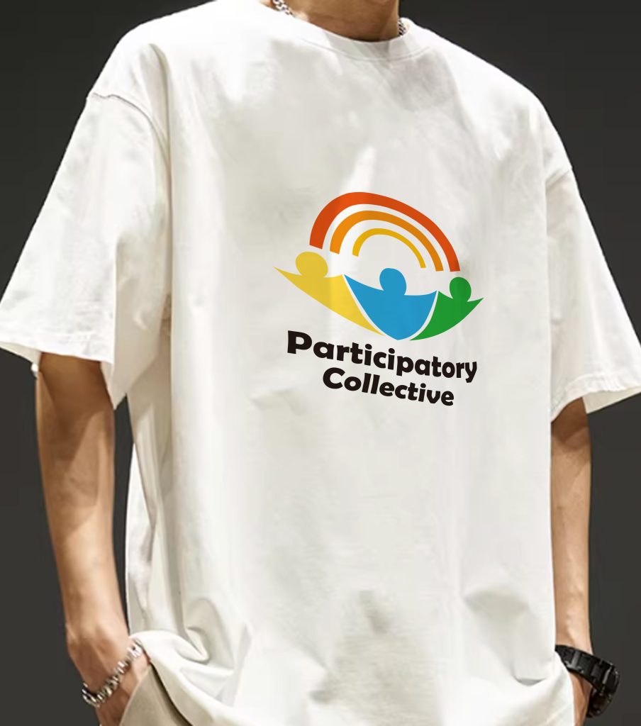
The following three apparel items are PC-themed outfits, featuring an extremely simple logo design on the clothing. Throughout the event, staff will wear these logo-adorned garments while serving participants. To accommodate varying weather conditions and temperatures, three of the most common clothing styles have been selected. Additionally, after the event concludes, these three styles will be available for purchase on the official website for users who wish to collect them.
Of course, after the event concludes, you may customize garments from these styles with memorable moments captured during the event. These can be rendered as photographs in various styles: 2D, realistic, different filters, and more. Upon request and within reasonable limits, the organizers will gladly assist you in customizing your desired “clothing” after your purchase.
The billboard features exceptionally large text to capture pedestrians’ attention. Like the website, it employs a background with a pure, high-contrast color to enhance visibility for passersby, subconsciously boosting user recall. The left side displays the PC’s full logo, while the right showcases a sun-like motif. With the sun as the focal point, its radiant rays directly convey the message of being a “source of energy.”
Written Campaign Overview:
1. Increase PC visibility through various advertising formats, including sidewalk ads, pre-app entry ads, and billboards on shops or buildings.
2. Build user base through online outreach and further expand from online to offline channels.
3. Leverage offline user feedback post-experience, such as offering gifts after events (e.g., scan a QR code to rate the event and receive an official plush toy). Additionally, have satisfied users share their experiences on online platforms like Instagram, YouTube, TikTok, Discord communities, and other social media/websites to amplify awareness and foster word-of-mouth growth.
Ultimately, this cross-platform strategy aims to evolve into a continuously growing cultural project, further amplifying its influence.
“More than just a festival, it’s a journey of discovery.” The ultimate beneficiaries of all these activities are those who face prejudice and varying degrees of discrimination due to race, nationality, accent, and other factors. We aim to minimize the internal resistance to these issues among those who discriminate, emphasizing that all people are fundamentally the same and should not be judged or discriminated against based solely on circumstances determined at birth. Simultaneously, we seek to foster greater cultural identity. Throughout all activities, equality prevails. The activities serve the people, and the people enjoy the activities.
Social Media Campaign Examples:
I created Instagram Stories and 1080×1350 pixel images for Participatory Collective (PC), along with 1080×1080 pixel Instagram Stories. In the 1080×1350 video, I incorporated numerous rainbow elements, interweaving footage of diverse individuals—representing different ethnicities and nationalities—collaborating or traveling together with rainbow imagery. Rainbows are often imbued with positive, uplifting symbolism, embodying hope, dreams, good fortune, and new beginnings. In Western culture, the legend of gold at the end of the rainbow is widely known, symbolizing the pursuit of dreams and a brighter future.
In the 1080×1080 video, I used a repeating rotating PC to subtly guide users, while the central logo slides into the homepage. This adds more memorable touchpoints.
Both articles are formatted for Instagram posting. To boost visibility, they’ll be shared across various platforms and websites, building a memorable brand image to retain existing users.
Narrated Project Walkthrough: The following video is a narrated demonstration of participatory collective prototyping and activities.