The Participatory Collective‘s Meaning and Introduction. And understanding of its mission:
To understand what a true Participatory Collective is, I consulted numerous websites (such as Oshi and butterflies) in hopes that these resources would help me better grasp the meaning of this term.
1.Butterflies
This website focuses on assisting individuals experiencing memory decline through an organization established to address a range of related issues. Founded in 2010, June Cooke (the founder) observed the scarcity of societal attention and social services for dementia patients. To alleviate this situation, she created this organization, which continues to expand its reach to provide support for more individuals living with dementia.
This website truly offers valuable assistance to many newcomers and those unfamiliar with this condition, such as: “Dementia is progressive and may involve memory loss along with difficulties in thinking, problem-solving, or language. It results from brain damage caused by diseases like Alzheimer’s or vascular disorders.”
This has significantly increased public awareness of Alzheimer’s disease.
2.Oshi
Social Context: “Our society is under immense pressure amidst an ever increasing wave of alcohol & drug related illness and death which is stretching the NHS as well as traditional alcohol and drug services to their limit. Neither the NHS nor traditional services are capable of tackling this increasingly alarming health crisis alone and traditional methods are failing to stem the increase in liver disease/illness/death.”
To address societal equilibrium anew, James established the Oshi department to challenge the status quo within treatment, addiction, and rehabilitation sectors, as well as dual-diagnosis mental health services.
Implement ”we’re a heart centred organisation and place the well-being of those we serve at the core of everything we do.“
Welcome to the OSHI Project in Hull, UK.
OSHI exists as a holistic rehabilitation community, offering everyone every opportunity to begin enjoying life and start healing body, mind, and soul through immersion in ongoing rehabilitation and personalized recovery programs.
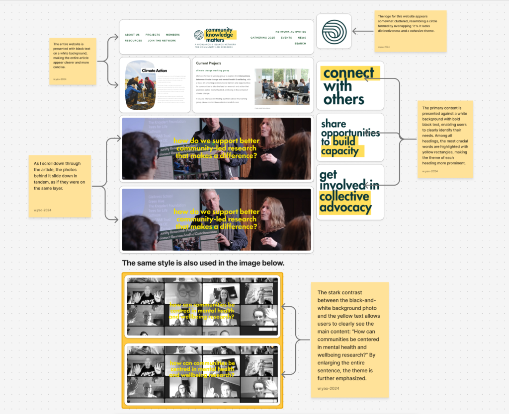
Community Knowledge Matters
The theme of this website is “How can we support better community-led research to drive impact?” and it conducts research on this topic.
Benefits
The entire website features a clean, minimalist design. Clicking on main headings takes users directly to detailed how-to pages, fostering a sense of familiarity. The layout employs overlapping white, yellow, and deep green elements. With the deep green already highly visible, yellow rectangles further highlight existing headings, making it easier for users to locate needed information and save valuable time.
Disadvantages
Regarding the logo design, I feel it’s a bit chaotic. The clean, minimalist aesthetic of the entire website clashes with the logo, making it seem somewhat out of place.
Community Knowledge Matters——Link for community knowledge matters
Jeder Institute
jeder provides a layer of protection for people with disabilities in the UK. “NDIS funding supports specialized behavioral intervention services, as outlined by the NDIS Commission, designed to develop personalized strategies for individuals facing disability and/or mental health challenges. These strategies respond to personal needs to reduce the occurrence and impact of concerning behaviors while minimizing the use of restrictive practices.”
Benefits
The entire website features a clean background, complemented by clear text and layout. A map-like image helps users grasp the information more easily.
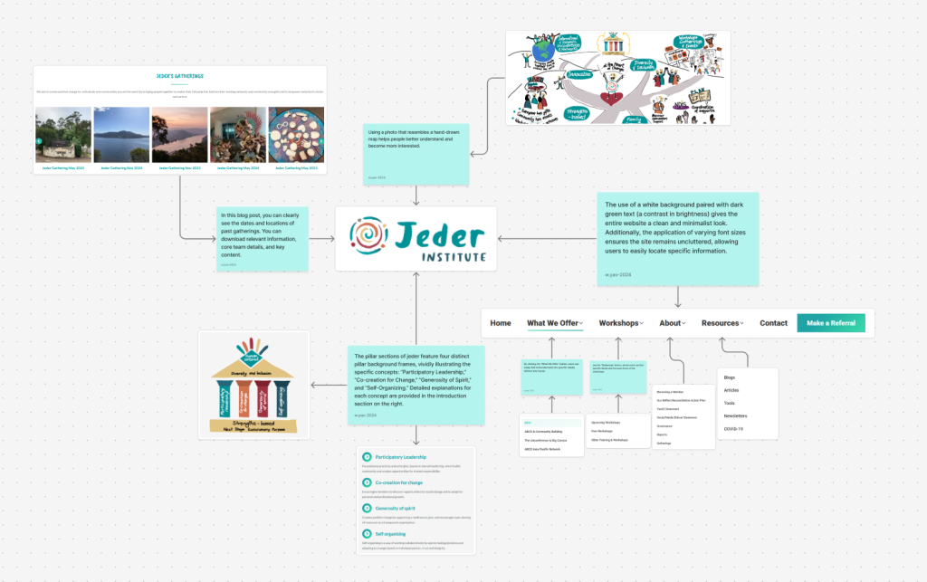
NDIS – The Jeder Institute——Link for Jeder
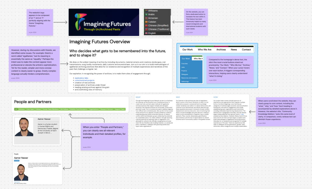
Imagining Futures
“Our goal is to promote the open and sensitive use of existing archives, create new archives, and articulate approaches to equitable archival practices that respect multiple and diverse narratives. We recognize that archives are inherently constructed and polyphonic. This is crucial as we seek to address the legacy of difficult and contested pasts. We harness the inherent power of archives to build trust, deepen understanding, and reveal interconnected histories, thereby reducing conflict within and between communities and enhancing the potential for sustainable peace. Our broader objective is to advocate for the formal recognition of culture as a fundamental human need by positioning cultural practices as vital spaces for negotiation. Consequently, we are also collaborating on a policy declaration within dialogues with governing bodies and supranational organizations.”—— by imagining futures
Benefits
I find this website’s logo quite creative. From a distance, it appears to be composed of an “I” and an “F,” perfectly aligning with the title “Imagining Futures.” The different colors within the logo correspond to the language flags selectable on the right side of the website, embodying inclusivity.
Disadvantages
The main issues with this website are as follows: First, when users scroll down the page, they are met with row upon row of text, which discourages further reading. The entire blog resembles the back of a medicine box label—complex words piled on top of each other, making the already dense text even more cumbersome. Second, throughout the blog, many words are unnecessarily sophisticated, making it difficult to grasp the meaning smoothly. For example, “egalitarian” essentially means “equality.” While the author likely intended to make the site appear more professional and high-end, this approach shifts the focus and actually increases reading difficulty.
Imagining Futures——imaginingfutures
My understanding
These social organisations provide significant assistance and contribute greatly to the advancement of society and communities. Provided vital assistance to certain groups of people
Benefits
These social institutions are best placed to gain the most direct and rapid understanding of the composition, characteristics, and most pressing needs of their local residents.
Disadvantages
Staff members may be enthusiastic but lack knowledge in project management, financial management, and professional social work skills, which can impact service quality and organizational development.
LOGO
This was my first logo design. Since the name is Participatory Collective, I envisioned creating a logo composed of the letters “p” and “c.” Because the “c” resembles a circle, I decided to start with it. I placed a large “c” on the outside and a small ‘p’ inside the “c.” However, the final result made the entire logo look like a “pwol” logo. Ultimately, I decided not to use this design.
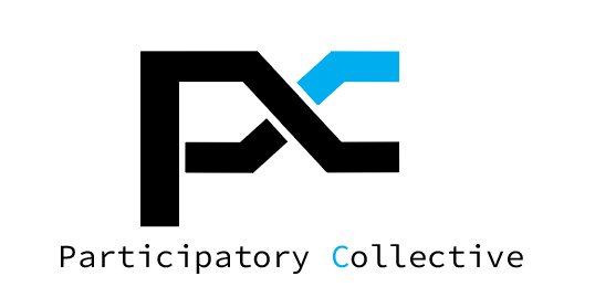
This is my second logo. I redesigned it by adjusting the p and c to the same size and attempting to blend them together. I replaced all strokes with straight lines for a more modern look, crossing the two lines to form “pc.” However, one issue was that the logo resembled a combination of p and x rather than p and c. Ultimately, I decided to make some improvements.
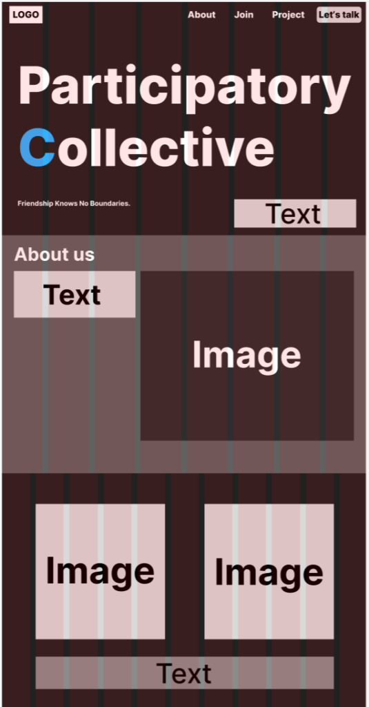
This is my final logo, the one that was ultimately chosen. I altered the original crossed lines, transforming the entire left side of the logo into a complete letter and reshaping the right-side pattern into a C-like form. To better distinguish the P and C, I changed the C in “Participatory Collective” to blue and also made the C in the logo blue, allowing people to more easily recognize the logo’s composition.
The initial inspiration for this logo drew from the Imagining Futures logo, attempting to combine the letters P and C—not as an image-based logo.
Colours
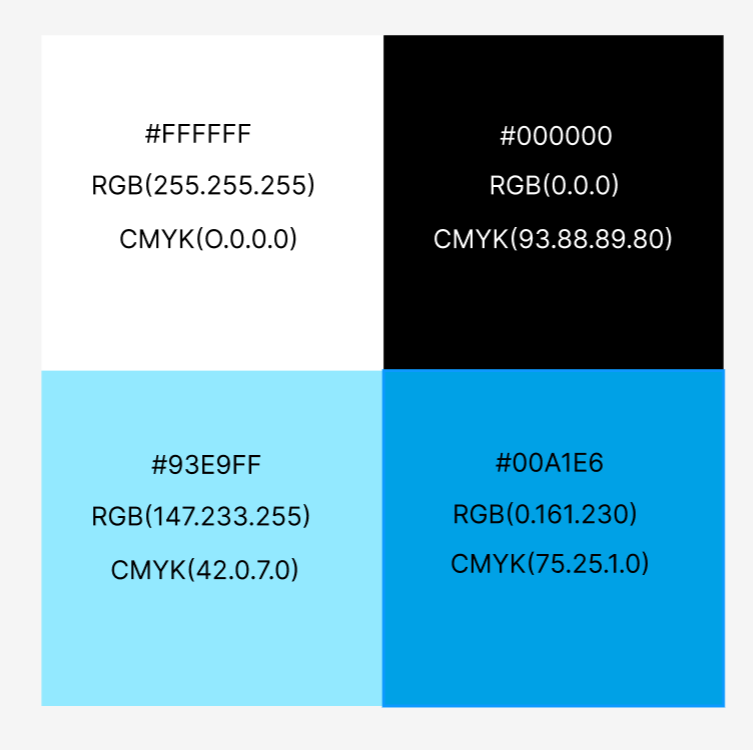
My inspiration stems from the principle that “community knowledge matters.” On this website, all text and typography are exceptionally clean and clear, with bold color contrasts. I drew upon this site’s color scheme, using black and white as primary colors to create striking contrast, accented with light and dark blue to further emphasize key information.
Font choice
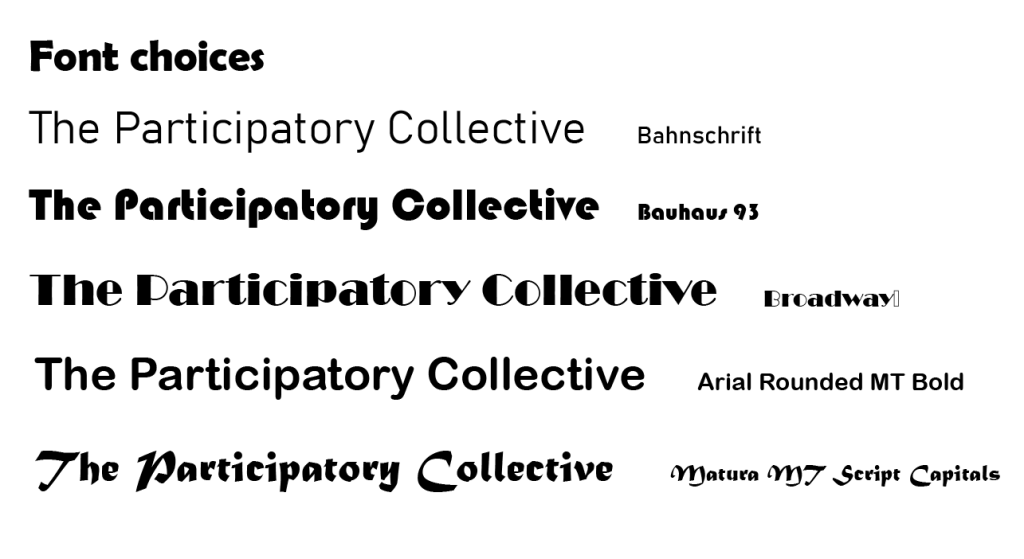
Bahnschrift
This font looks rather good overall, though it might appear a tad too thin when used beneath a logo. It works well for body text in articles, appearing quite formal without seeming fussy.
Bauhaus 93
This font has a distinctly tech-inspired aesthetic, but its exceptionally bold weight can appear overly crowded and visually heavy when used for body text. Additionally, the capital letters O and C are nearly indistinguishable in this typeface, significantly impacting readability. As a headline beneath the logo, it would compete for attention with the graphic logo and is therefore unsuitable for this website.
Broadway
This font has a distinctive feature: nearly all letters are wider on the left than on the right. When used throughout an entire article, it creates a particularly cluttered appearance. Additionally, without adjustment, the font appears slightly squashed, further compromising the user experience. The spacing between characters is too narrow, and combined with the exceptionally thin right edges of each letter, it gives the impression that every character is glued together. It is not suitable for use as a body text font.
Arial Rounded MT Bold
This font is a very standard text font, and among my selections, I consider it one of the most suitable options. It bears almost no difference from fonts familiar to all users, making it well-suited for use in logos or articles without feeling out of place. Additionally, the font is crisp and clear, with appropriately balanced letter spacing.
Matura MT Script Capitals
This font resembles a handwritten style. My initial intention in selecting it was to emulate the form of medieval letters, seeking a typeface similar to handwriting. However, after experimenting with large blocks of text, I discovered that when arranged in substantial quantities, the resulting document appears particularly messy. This stems from certain uppercase letters being significantly larger than standard uppercase characters in conventional fonts; Additionally, certain lowercase letters like “c” and ‘t’ become too similar in this font, sharing the same issue as the “Bauhaus 93” typeface. Ultimately, this font was also excluded from consideration.
Summary: Ultimately, I decided to use “Bahnschrift” and “Arial Rounded MT Bold” as the primary fonts for this website. Initially, I considered using only Arial Rounded MT Bold, but employing it for both the logo and body text would create redundancy and lack distinction. Therefore, I selected Arial Rounded MT Bold for the logo—its bolder, more prominent appearance ensures clear visibility even in the logo context. Bahnschrift was chosen for the body text because it’s widely recognized and has well-balanced letter spacing. This font avoids appearing cluttered and ensures a comfortable reading experience for users. As a body text font, it offers excellent clarity with distinct letter shapes, minimizing the hassle of misreading information.
Stakeholders
My research involves numerous stakeholders, for example: Community knowledge matters. The primary stakeholders of this website are practitioners and decision-makers from Scotland and beyond, representing grassroots communities and organizations. They are interested in greater involvement in research to support community action, including initiatives around mental health and wellbeing. The ethics of care are community-centered.
Imagining futures, his philosophy holds that archives are negotiations about visions of the future—the stories that will continue to be told, how they will be told, and who will be silenced. These questions become particularly acute in moments of conflict, displacement, and reconstruction, where stakeholders inevitably include certain legacies of world history and certain world cultures.
For me, my theme is similar to Imaginingfutures, both focusing on the world and culture, with stakeholders including: local indigenous peoples, international students, and immigrants.
The concern lies in how to communicate with people of different ages from different countries and how to engage in conversations.
What do you want your final website and campaign to achieve?
I’ve decided to design a website dedicated to global cuisine, featuring offline venues where users can participate. My hope is to foster connections through food, promoting exchanges among international students, locals, and immigrants. From my perspective, many international students tend to form their own circles, rarely interacting with local students or peers from other countries. The distinction between studying abroad and staying at home has also blurred significantly. Therefore, I aim to create a website and organize events that bridge cultural gaps between nations while challenging many people’s stereotypes.
How will it work?
Hosting a festival or gathering like the Hull Fair features both official and private stalls. Official stalls feature world-renowned cuisine and historical posters to promote cultural understanding. Individuals can also register to share snacks and delicacies. However, due to limited space, participation isn’t guaranteed for all applicants. Personal stalls require paid registration, available on the designated sign-up date.
What will it include?
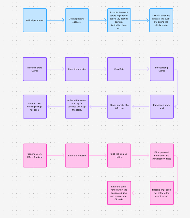
Participants include: official entities, users, and individual shops.
CTA
“Friendship Knows No Boundaries.”
This theme aims to encourage people of different nationalities and ages to bridge cultural differences, foster greater cultural understanding, and deepen knowledge of diverse cultures.
Low fidelity
I refined the website homepage with different layouts to achieve greater precision.
Research
Welcome to the OSHI Project in Hull, UK.
Community Knowledge Matters——Link for community knowledge matters
NDIS – The Jeder Institute——Link for Jeder
Imagining Futures——imaginingfutures