These posts aim to further improve the user experience (UX) and user interface (UI) of the glastonbury festival companion app.
APP design
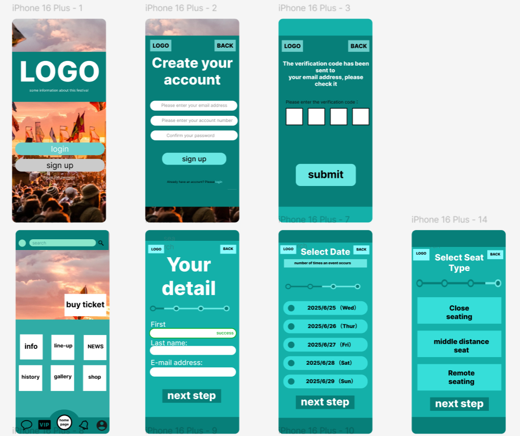
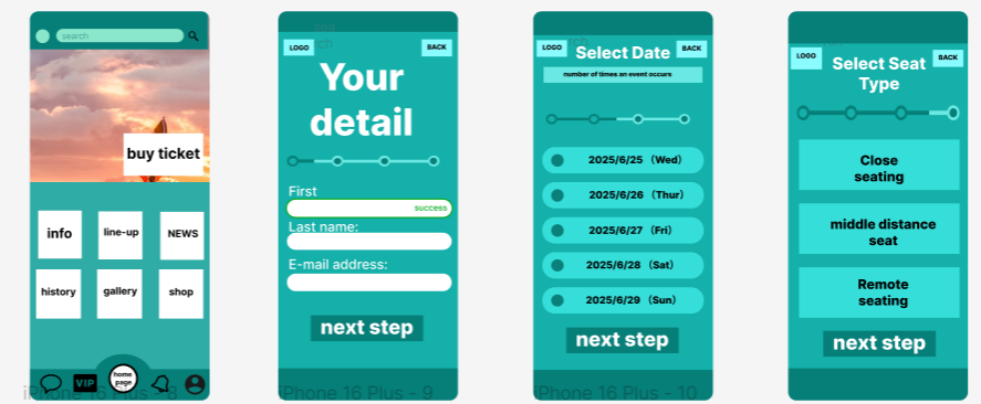
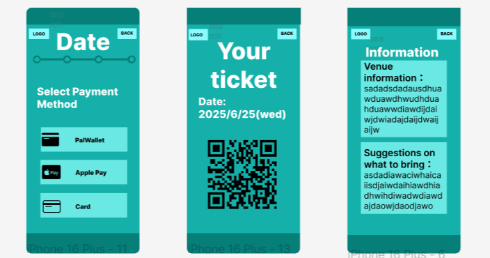
The following are further improvements to the low-fidelity prototype, simulating the user purchase page and account creation process, giving button functionality through figma, and referencing some of the user’s setup needs to make some improvements to the typography

To ensure a better user experience, the following principles should be observed:
Simplicity – keep the design simple and focused on the user’s primary goal.
Consistency – Maintain consistency across the website in terms of the app. Ensure consistent behaviour for similar operations.
Accessibility – Design for all users, including those with disabilities. Ensure that contrasts are sharp and suitable for users who are colour blind or weak.
User-centred design – understand the needs, goals and behaviours of the target audience. Prioritise user needs over personal preferences or trends.
Clarity – Ensure that interfaces are easy to understand and use. Use clear labelling, intuitive icons and simple language. Provide different language settings to make it easier for people from other countries to use.