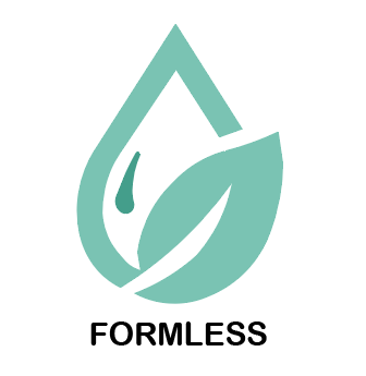
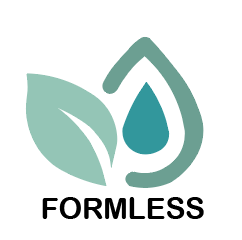
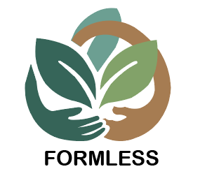
These are my three logo designs.
This logo combines the positive and negative forms of a circle and a leaf to create the design. The simplicity of this pattern inspired me to create a straightforward logo, using the central leaf as the starting point for my own design.
FORMLESS
The initial concept behind the first two logos was to combine water and leaves, two quintessential elements of nature that are universally recognised. The leaf outline and droplet form within the graphic intertwine, mirroring nature’s symbiotic relationships. Through morphing, I unified both elements into a single entity. However, this logo was ultimately not adopted due to its lack of visual impact. It proved difficult to make memorable and struggled to convey the company’s core values, such as environmental sustainability.
I ultimately selected the third logo design, which directly depicts a pair of large hands cradling three leaves. Centred on embracing hands supporting vibrant foliage, it intuitively embodies the company’s motto of protecting and nurturing nature – a core thematic element. The leaves’ varying colours symbolise different seasons, plant species, and growth stages, emphasising that environmental conservation is not a temporary endeavour but an ongoing commitment. The outer hands symbolise how each individual’s protection of plants, ecosystems, and the environment is profoundly vital, demanding collective effort.
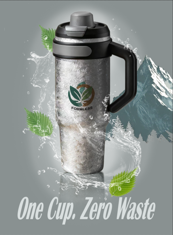
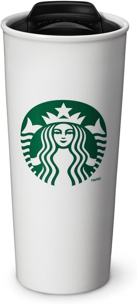
The illustration above depicts my concept of mounting the logo onto a stainless steel thermos flask. The logo’s vibrant hues create a striking contrast against the flask’s monochrome black, white and grey design. This inspiration stems from Starbucks water bottles, where the overall white surface forms a vivid counterpoint to the intricate logo, resulting in a memorable and highly recognisable aesthetic.