Introduction:
This article will analyse the following three briefs, creating mood boards, user personas, brand prisms, brand personalities, and brand matrices respectively.
Eco Future——A style for a green or eco friendly company
Cab-E Online—— a new local taxi firm looking to dominate the online space
Influence Hull——a business consultancy group
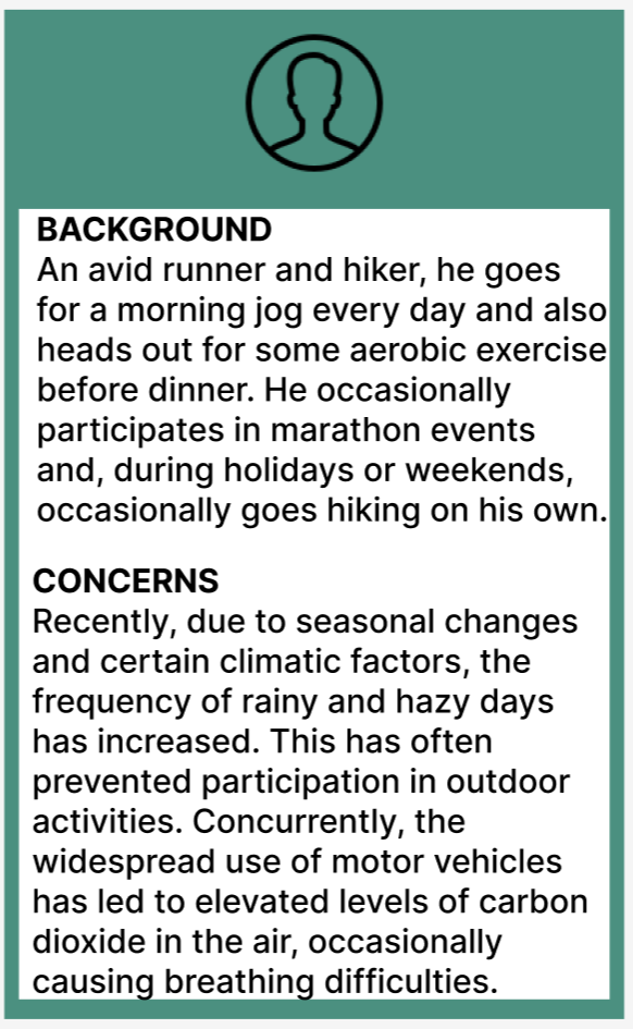
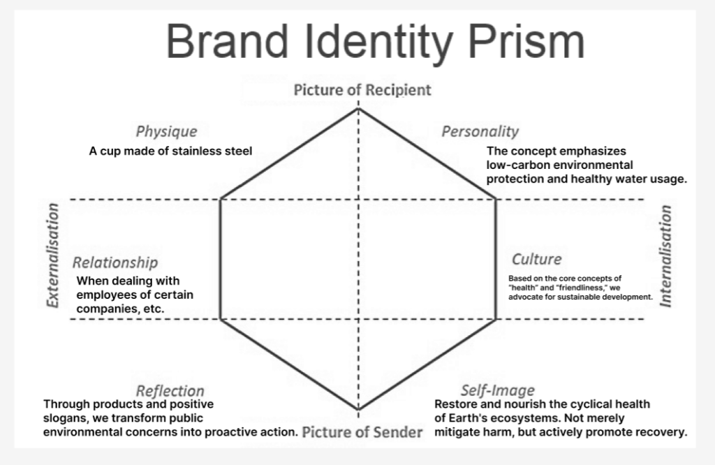
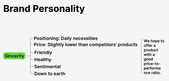
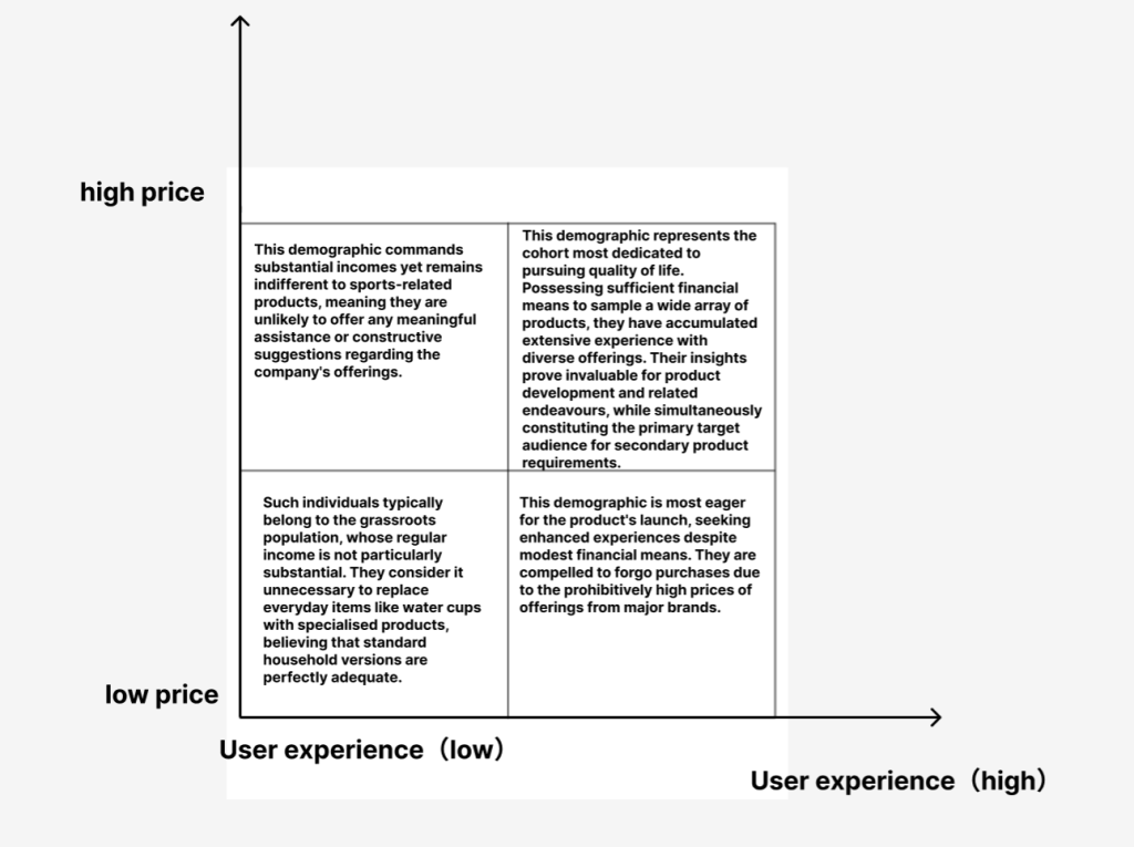
Eco Future is an environmental protection company that frequently contributes significantly to community slogans and eco-friendly initiatives. To offset these expenditures, the company also manufactures stainless steel insulated water bottles for the sports industry, primarily promoting low-carbon commuting and green living. Its products are widely favoured for being competitively priced compared to industry peers.

This mood board showcases numerous photographs and company websites predominantly featuring green as the primary colour. Research into various corporate logos reveals that most environmentally conscious companies employ green as their principal logo colour, as it symbolises sustainability, recyclability, and reusability.
Cab-E Online: This company specialises in taxi services, leveraging its extensive network and streamlined driver licensing process to establish a substantial customer base. Its app enables swift driver connections, with time efficiency being one of its key advantages.
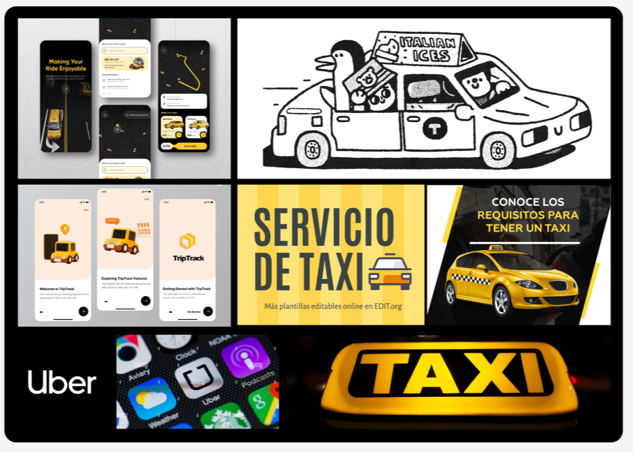
For this mood board, I researched the homepages and logos of numerous prominent apps currently available on the market. The predominant colour palette predominantly features black, yellow and grey, with these three hues collectively conveying a sense of minimalist elegance. This aesthetic aligns with the taxi service’s slogan of efficiency and convenience.
Influence Hull: This company is a highly influential business information provider, renowned for its prompt customer service and convenient contact methods.
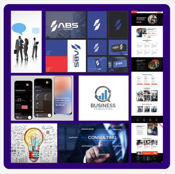
For this mood board, I have incorporated numerous informational photographs alongside some images sourced from the internet. Given that the foremost priorities for commercial information companies lie in the speed of information flow and the capacity to receive information, the overall blue colour scheme was chosen for its calming atmosphere and more professional feel.