This article is the design concept for the website homepage.
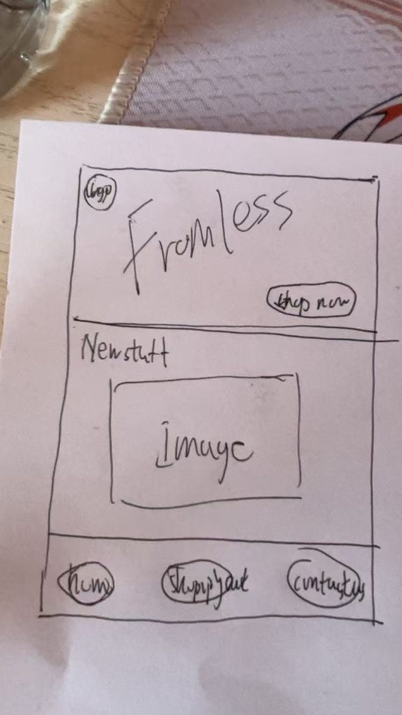
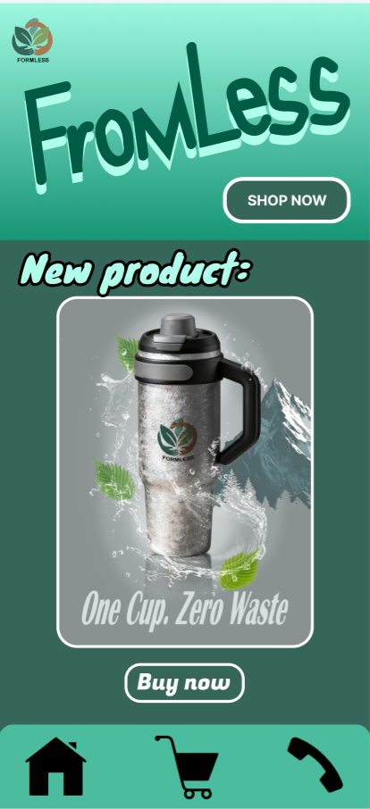
This is my initial design sketch. The left-hand side depicts the original concept, where I positioned the brand name prominently at the top centre. The brand logo is placed in the top-left corner, with the latest products displayed below. Featuring these on the homepage enhances sales and generates buzz for new arrivals. The three buttons at the very bottom represent: Home, All Products (Shopping Cart), and Contact Us. Positioning these three crucial elements prominently at the bottom prioritises user convenience—a fundamental requirement for corporate websites. Simpler icons convey meaning more rapidly, and these buttons represent the most essential functionalities.
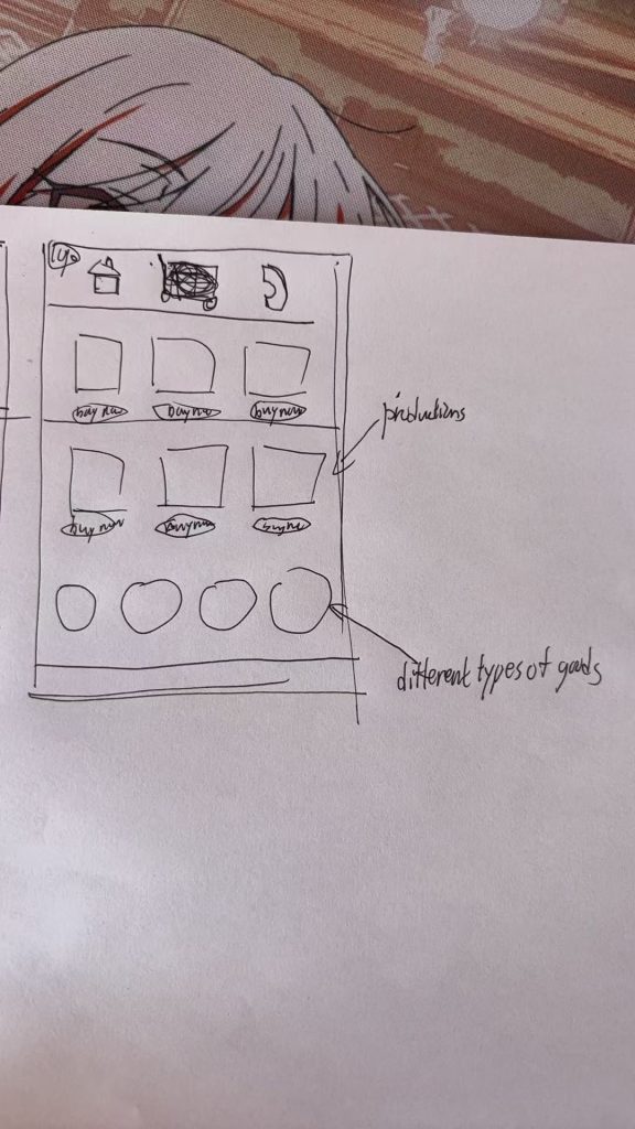
In this preliminary design on the right, I have positioned the buttons at the very top. I have removed the large section previously allocated for the company name, replacing it with a button linking to the homepage and another for contacting us. The middle button relating to the shopping cart has been removed, with its functionality integrated into the homepage instead. Beneath these buttons, one can view various products offered by the company, thereby enabling users to more clearly select the items they require.
Following user surveys and feedback, I ultimately opted for the first approach. This solution offers greater clarity and proves more effective at retaining visitors on the homepage. The second option resulted in an overly fragmented layout, rendering the homepage too cluttered. Consequently, I rejected this design.