First, an initial wireframe allows me to quickly define the content framework for my project. Through a concise page structure, I can swiftly grasp content priorities and page organization, effectively avoiding distractions from premature discussions about visual styles that might divert attention from the core objectives.
Second, as an intuitive visual tool, it provides a clear sense of areas needing refinement. Changes can be easily implemented before the actual webpage is built.
Another key value of initial wireframes lies in their high flexibility and low-cost nature. Since they don’t require extensive design details, numerous revisions—much like sketching a rough draft—can be made early on. This approach emphasizes the big picture while making it easier to adjust layouts or address design flaws.
Specific content of the inner pages
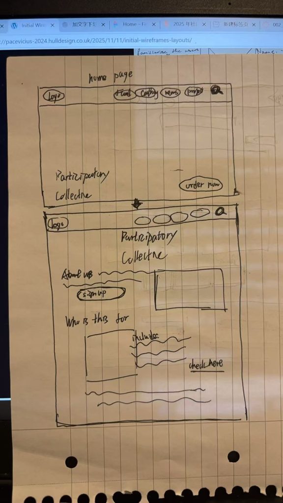
The first page is my concept for the homepage. When you click the button in the bottom right corner (Order Now), it takes you to an article about us. I created a section at the very top of the page, placing the most important buttons there. My idea is that as you scroll down the entire page, this section will scroll down with your scroll wheel (the section always stays within your view). This allows you to access crucial information at any time. I believe this feature is particularly valuable for users navigating lengthy articles.
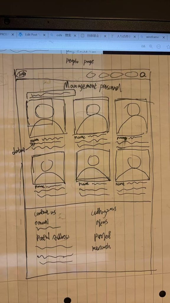
This page serves as my people page. I envision that through this page, users can clearly identify management and staff members, conveniently access each individual’s position and contact information, and accurately understand their professional capabilities and personal details.I plan to arrange personal photos horizontally to maximize space efficiency and facilitate easier user searches. Personal information will be simplified, but users can click “more” to view detailed profiles when needed. This allows users to effortlessly locate the appropriate staff member for inquiries.
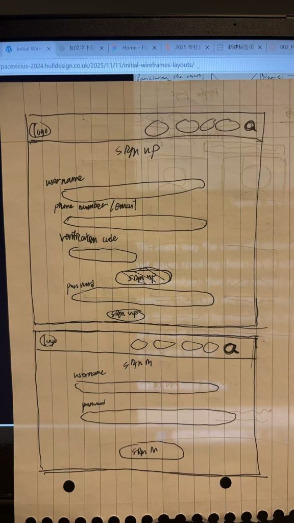
This is my sign-up page. After referencing numerous websites and drawing inspiration from them, I created an extremely minimalist sign-up process requiring only a username, password, and email/phone number. Aside from the identical top section common to all pages, This interface prioritizes minimalism because overly complex designs or lengthy processes often frustrate users. Keeping it simple reduces time spent on registration while a clean layout conveys benefits like convenience, clarity, and a refreshing feel.
The same applies to the login interface, which follows the minimalist design of the sign-up page. This approach saves time during login and allows users to access the page more quickly.
This page provides the address and participation details for this event. Users can select their preferred time slot within the three bolded boxes below. Above these boxes, you’ll find event descriptions, historical details, and images. Ensure the margins on both sides are uniformly sized. As you scroll down the page, reduce the information density to give your brain space to process the content.
This is the main page of the Idea Foundation. While keeping the most important sections at the top unchanged, the entire page frequently references “https://theideasfund.org/projects/projects,” including image layout, text layout, name formatting, and more.
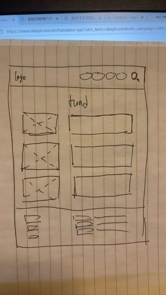
Summary: This is the main page of the Idea Foundation. While maintaining the most critical sections at the top unchanged, the entire page frequently references “https://theideasfund.org/projects/projects,” including image layout, text layout, name formatting, and more.
The advantages of web page layout primarily manifest in enhancing user experience, improving maintainability, and optimizing visual presentation. By strategically organizing page structure, users can locate information more quickly and enjoy a clear, seamless browsing experience. Standardized layouts facilitate easier updates and expansions during website maintenance. Additionally, a unified and coordinated design elevates overall aesthetics and reinforces brand professionalism. Furthermore, effective layouts enable responsive adaptation across different devices, clarify information hierarchy, and boost team development efficiency.
Reference: