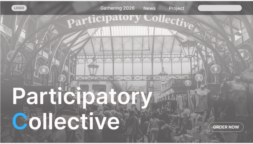
I placed the webpage title in the bottom-left corner and positioned the entry button in the bottom-right corner to create visual balance. Then, I placed an animated photo as the background across the entire bottom of the webpage, enlarging the overall image. I adjusted the text color to contrast with the photo’s background, making the title text stand out more clearly. At the very top of the webpage, I positioned the site’s most crucial buttons to facilitate users’ access to important information. As users scroll down using the mouse wheel, the corresponding sections at the top scroll down accordingly. This design allows users to navigate to other interfaces or search for information accurately during their browsing experience without needing to return to the top of each page to make selections. Additionally, I set the transparency of the entire section background to 50% and applied a slight blur effect. As the entire interface scrolls, the background color of the page also changes.
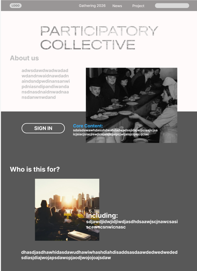
I placed the sign-in button in a prominent position on the main page to make it easier for users to discover and use. Meanwhile, the main title “PARTICIPATORY COLLECTIVE” features large, eye-catching typography that creates a clear visual focal point, helping to establish brand recognition. Ample white space is incorporated throughout the layout—particularly at the top and around the About section—to prevent visual clutter and enhance readability. Consistent left alignment and spacing for text, headings, and images lend the page a clean, professional look with a sense of order.
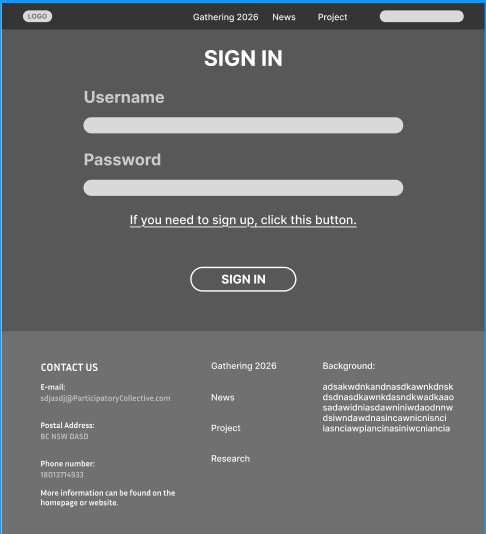
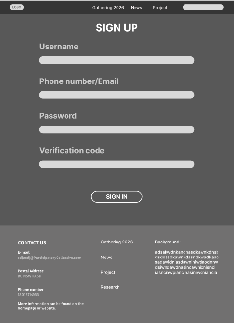
The visual style of these two webpages is consistent. The navigation bar and footer information maintain uniformity, enhancing the website’s overall cohesion. Input fields are neatly arranged with ample white space, making them easy for users to read and interact with. Meanwhile, primary buttons are prominently displayed, effectively guiding users to complete key actions. For example, the “sign in” button is visually easy to locate as an entry point for action.
The login page features a streamlined structure requiring only username and password input, ideal for returning users seeking quick access. Simultaneously, the page includes a prompt stating “Click here to register” to smoothly direct new users to the sign-up process, enhancing both user experience and conversion efficiency.
The registration page is comprehensive, featuring fields for email/phone number, password, and verification code to enhance account security and subsequent verification. Multiple information fields are clearly arranged with a well-defined process flow, making registration steps easy to understand. Its visual and layout style aligns with the login page, ensuring a seamless transition in user experience.
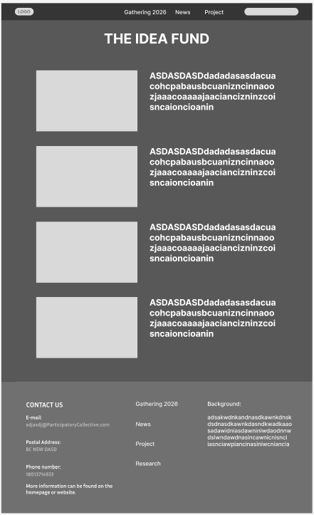
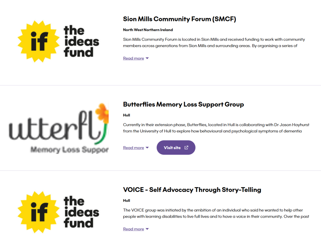
The layout of this entire page draws heavily from the design of the idea fund website, including its foundation sections. By referencing this site, we optimized the wireframe’s structural layout and achieved significantly improved results.
Reference: