LOGO
As glastonbury festival is one of the largest music festivals in the world, I used a lot of music elements in the logo design, adding and circus and pop music text, at the same time, the triangle above the logo text is also one of the symbols of the festival, which is a miniature of the whole stage.
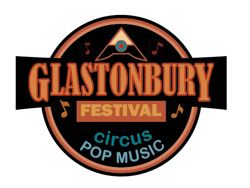
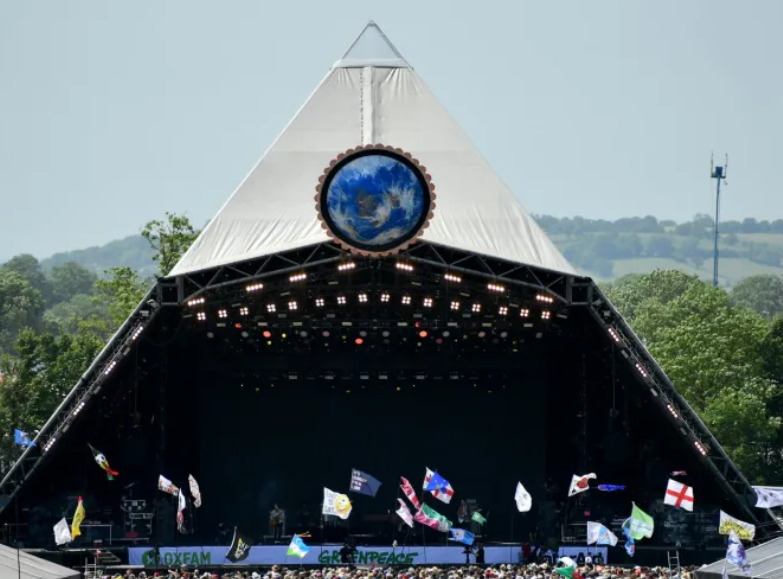
Inspired by the design of many badges, environmental protection as the theme, adding the most obvious pyramid stage, the most intuitive to the name of the festival to amplify, more prominent themes.
rejected designs
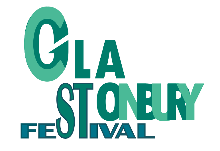
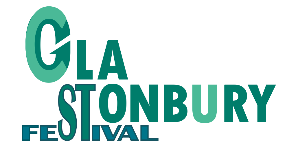
Typography
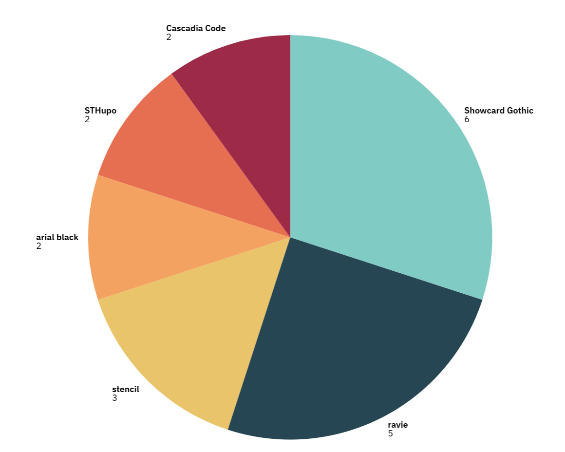
The beginning of the text design is not the last font showcard gothic, the beginning of only the first five fonts, most people choose between the third font in the fourth font, choose the third font because you want to jump like a musical note, there is a kind of spiritual beauty, but too messy. The fourth font is a very formal print font, more simple and easy to understand, more formal, but and the music festival theme is a bit incompatible with the joyful and lively, and thus ultimately chose the last type of fonts. Finding the six fonts and re-doing the user research resulted in the following pie charts.Finally decided to use this version of the font.
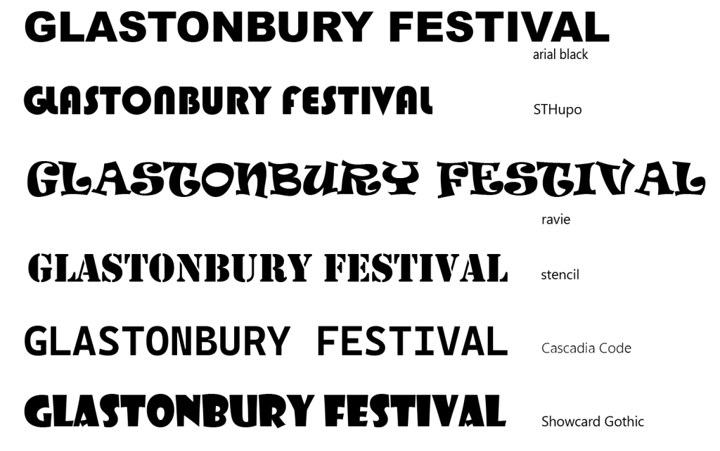
Arial Black——This typeface has a super-stable geometric structure and remains sharp enough in low-resolution environments. but the typeface is too simple and spatially too evenly distributed.
STHupo——The font itself has changed a lot, there are individual fonts are more similar, if as a general font is not easy to read the information, easy to miss the information.
Ravie——The strength of this font lies in the irregular outline jiggle that creates a hand-drawn texture, but the characters are equally exaggerated unsuitable for longer articles.
Stencil——This font is ideal for military style designs and industrial equipment logos, not for websites or apps.
Cascafia Code——The advantage of this font is the precise character alignment, which is very neat, but the disadvantage is also obvious, as with the first font, it is too monolithic (there are only three combinations of hyphenated characters) not to reflect the joyful and lively feeling of the music festival.
Showcard Gothic———The highly expressive and decorative text, with its distinctive visual style, can create a unique sense of atmosphere in a music festival.
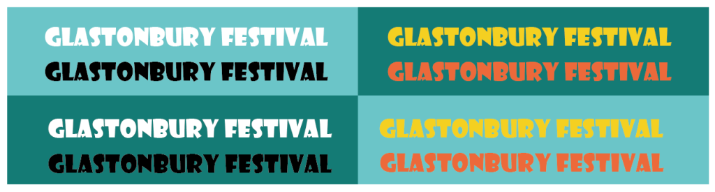
Black, white, yellow and orange were put into dark green and light green backgrounds to investigate the extent to which better font colours fit the background. The stronger contrast between black and white has been favoured by a wider range of people.