This post will begin to focus on the design elements of the website and accompanying apps.
Mood Board

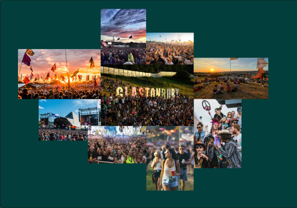
I chose to put the glastonbury festival themed photo in the middle, more so with the festival name as the main factor, and wrapped it up with documented photos of the festival over the years, mixed with vibrant colourful images.
The background colour is dark green, which is the highest percentage of the eight colours in the user survey, and is also the colour that promotes environmental protection.
Colour Planning

The above eight colours are the results of a survey of 20 people on their choice of colours.
About half of the people chose green as the main colour palette, and black and white were also more prevalent, with users believing that the collision of black and white colours creates a great contrast and visual impact.
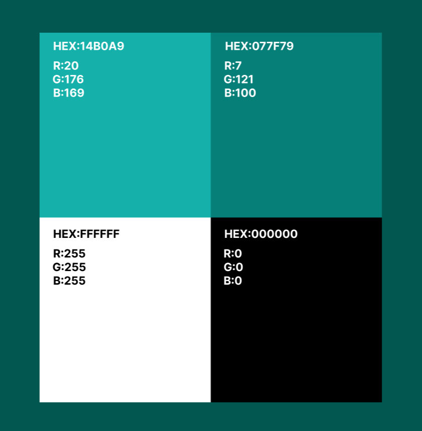
A colour palette created using Adobe Illustrator

I used two different colours, green and black and white. The green colour is to express the protection of the environment, as the world’s largest open-air music festival, the amount of rubbish produced each year is not to be underestimated, and the green colour is the equivalent of an environmental protection slogan to promote environmental protection. The contrast between black and white also makes the website and app more eye-catching.
reference:
- https://tenten.co/learning/designer-moodboard-guide/———Nora UX(October 13, 2024)
- https://boardmix.cn/article/5stepsmakemoodboard/