In this whole collection, my theme is about human nature, to explore different human nature, through some data and other information to convey the difference of human nature, but also to better tell people the importance of human nature.
tentative idea
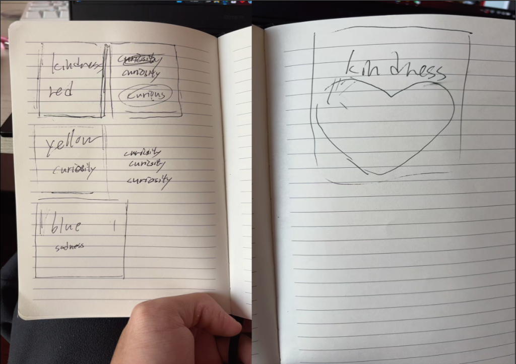
In the beginning I wanted to use three colors to represent three completely different human aspects of character and quality, and in the end I decided to use red, yellow, and blue as the main colors for an initial color palette for my entire portfolio.
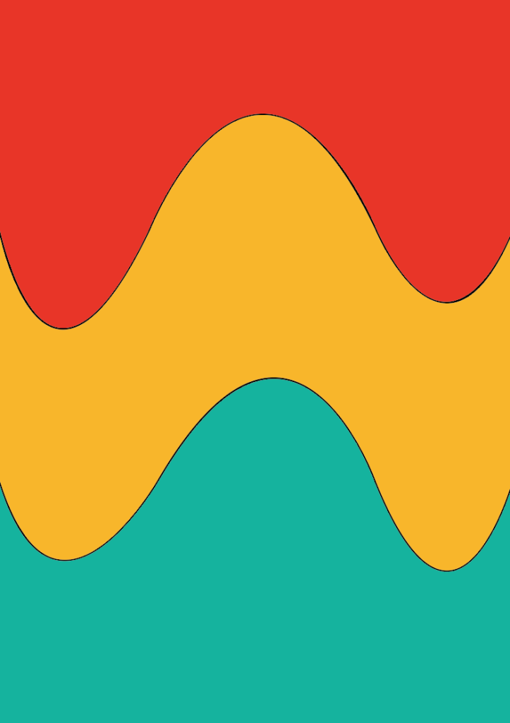
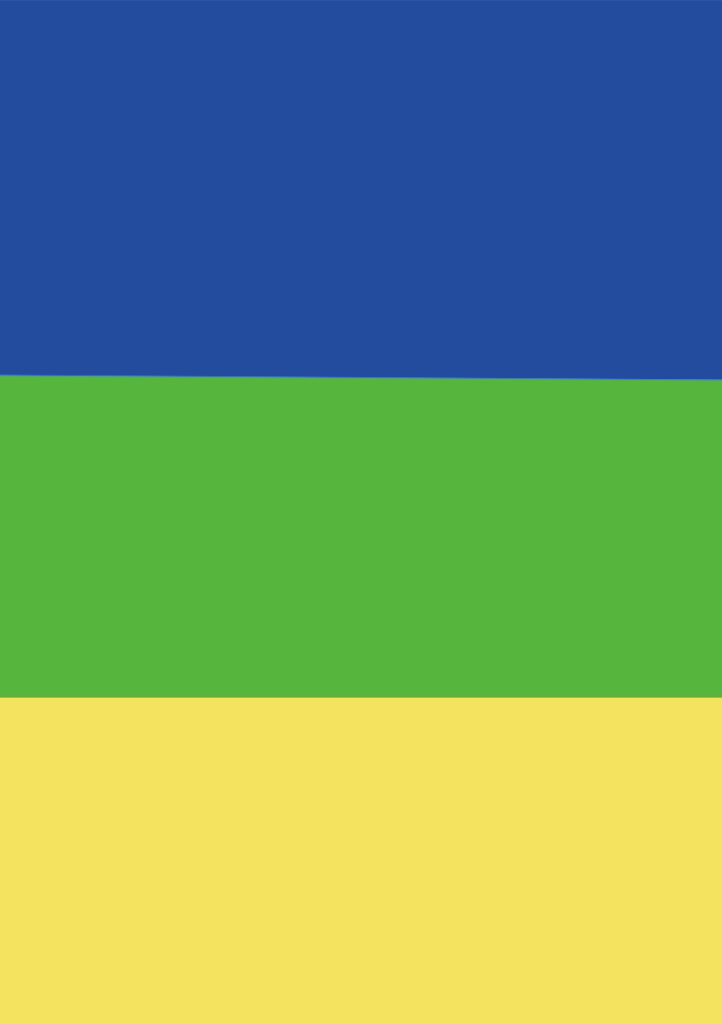
I chose three colors that don’t look out of place in combination for comparison to see if these colors could be used in a portfolio
For the initial finalization of the inner pages
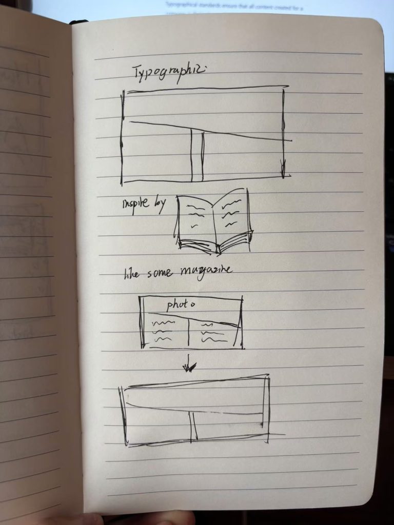
About the inside page I want to make a kind of magazine-like form, the top is the photo, the bottom is the copy, in determining the form has not yet thought about what photos to use as the inside page decoration is the best.
Here are some of my attempts at some graphic styles
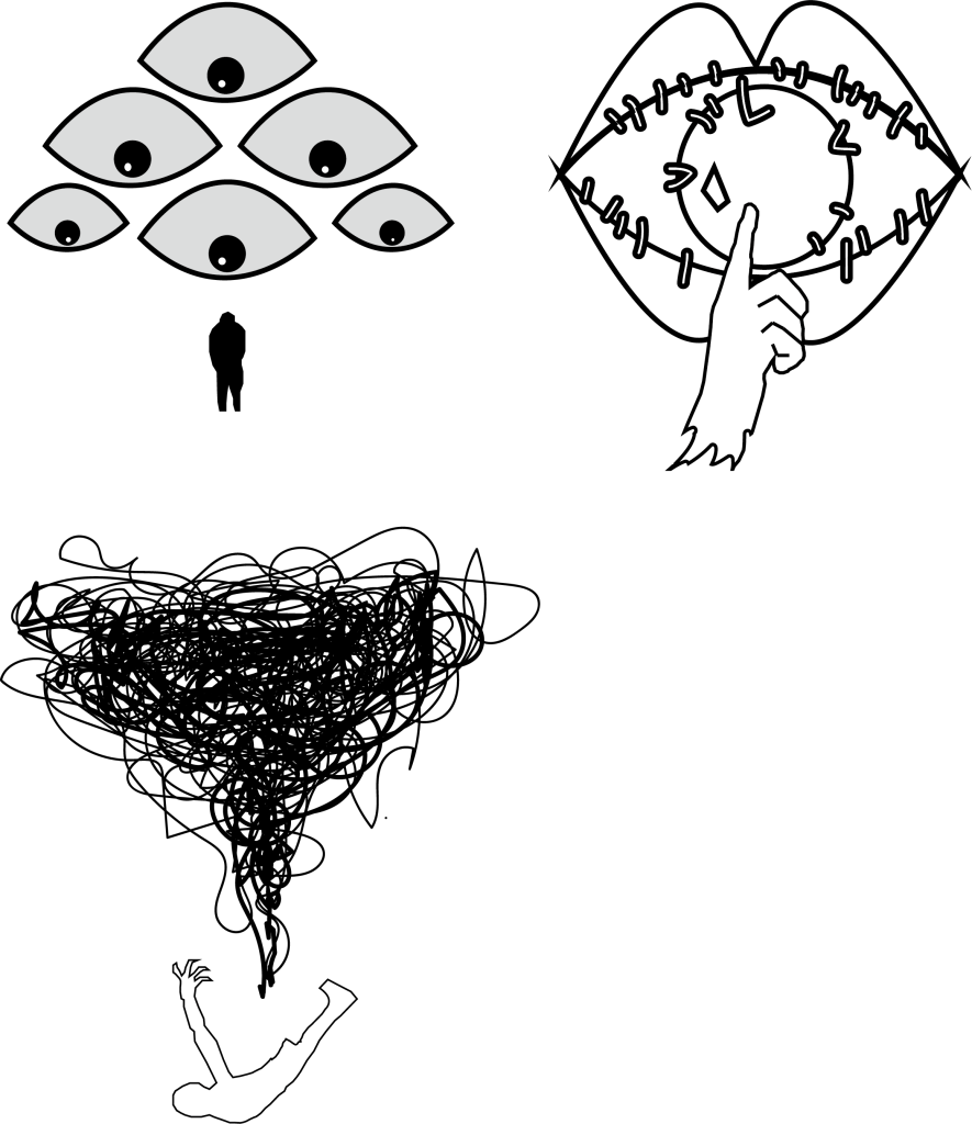
In the beginning I wanted to use a lot of eye elements, and some messy lines to show the differences in human nature, and at the same time use the lines to indicate that irregular life sometimes brings a lot of bad emotions and qualities to people.